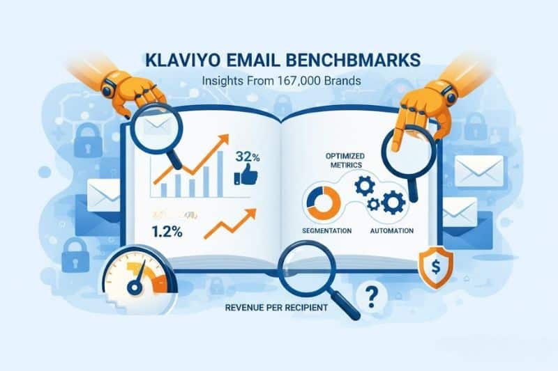
Most marketers know their own numbers. Few know if those numbers are any good.
You might be getting a 32% open rate, wondering if you should celebrate or panic. Your abandoned cart flow converts at 1.2%, but is that excellent or embarrassing? And when someone tells you to “optimize for revenue per recipient,” what number should you even aim for?
Klaviyo analyzed over 167,000 ecommerce brands to answer exactly these questions, and the data revealed something interesting: the difference between average performers and top performers isn’t about budget or brand size. It mostly comes down to segmentation, automation, and knowing which metrics are worth optimizing for.
In this article, we’ll explore what Klaviyo’s numbers mean and, more importantly, what to do about them. Keep reading!
Key takeaways
- Top 10% of Klaviyo users get 5x higher order rates and 7x higher revenue per recipient than average performers when focusing on segmentation and automation.
- Automated flows consistently outperform campaigns by 3-4x in open rates, clicks, and conversions.
How Klaviyo email benchmarks work

Before we dive into the numbers, you should know how Klaviyo decides what “good” means for your account.
Klaviyo doesn’t compare you to every brand on the platform. That would be useless since a $50M jewelry brand and a $500K electronics startup shouldn’t share the same benchmarks. Instead, Klaviyo builds a peer group of roughly 100 companies similar to yours based on:
- Industry
- Average item value
- Total revenue and growth rate
- Email frequency (% of days with an email campaign sent)
- Email revenue as % of total revenue
Your peer group gets more specific as Klaviyo learns more about your business. If you haven’t set your industry in Organization > Contact Information, do that first, otherwise your benchmarks will be generic.
Benchmark data updates monthly on the 10th. You need at least 25 emails or SMS sent in the last six months to qualify. If you just became eligible this month, you won’t see data until next month’s update.
Performance is bucketed into four tiers: Poor (below 25th percentile), Fair (25th-50th), Good (50th-75th), and Excellent (above 75th). If you’re in the 70th percentile, you’re beating 70% of similar brands.
Campaign benchmarks: where most brands land
Campaigns are your broadcast emails: product launches, seasonal sales, newsletters, etc.. They go to list segments instead of individual triggers.
Here’s what average performance looks like across 167,000 Klaviyo accounts:
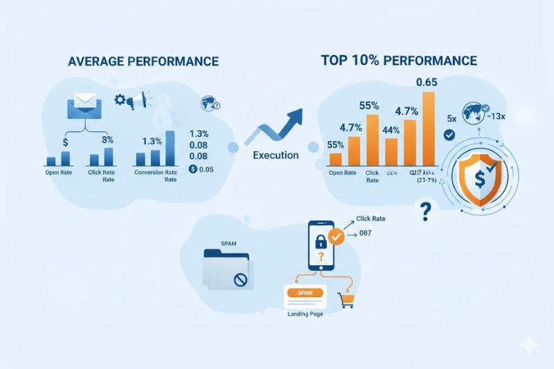
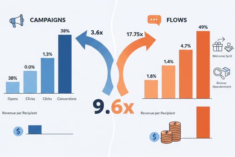
Overall campaign averages:
- Open rate: 37.93%
- Click rate: 1.29%
- Conversion rate: 0.08%
- Revenue per recipient: $0.048
Top 10% performance:
- Open rate: 54.78%
- Click rate: 4.74%
- Conversion rate: 0.44% (5x higher)
- Revenue per recipient: $0.65 (13x higher)
Industry variation is smaller than you’d think. Campaign open rates range from 35.67% (Mass Merchant) to 39.90% (Sporting Goods), which is a spread of just 4 percentage points. Click rates vary from 0.91% (Health & Beauty) to 1.58% (Toys & Hobbies), and conversion rates go between 0.04% (Electronics) and 0.17% (Food & Beverage).
Translation: Industry is far less important than execution.
A quick note on open rates: Apple Mail Privacy Protection prefetches tracking pixels, which artificially inflate opens for any subscriber using Apple Mail. If half your list is on iOS, your “real” open rate is lower than Klaviyo reports. This is why your focus should be on the click rate and revenue per recipient. They can’t be faked.
Campaign performance tells you if your messaging resonates at scale. Improving Klaviyo email integration inbox placement rates helps ensure those messages actually reach the inbox. Low open rates mean your subject lines aren’t compelling or your emails are landing in spam.
Low click rates usually point to a weak offer or a CTA that is buried between walls of boring text. With low conversion rates, there’s usually a disconnect between what you promised in the email and what’s on the landing page.
In most cases, campaigns underperform flows. The difference can often be massive, and we’ll show you why next.
Automated flows: where the real money is
Flows are triggered emails based on shopper behavior; welcome series, abandoned carts, browse abandonment, and more. They go to one person at a time, at the exact moment they’re most likely to engage.
And they absolutely destroy campaign performance:
Overall flow averages:
- Open rate: 48.57%
- Click rate: 4.67%
- Conversion rate: 1.42%
Top 10% performance:
- Open rate: 65.74%
- Click rate: 12.21%
- Conversion rate: 4.93%
Flows outperform campaigns by 28% on opens, 3.6x on clicks, and 17.75x on conversions. That’s not a rounding error. It’s a different game altogether.
But why is that so? It’s because flows are contextual. A welcome email lands when someone just opted in and wants to hear from you. An abandoned cart email reminds someone about a product they were seconds away from buying. A browse abandonment flow shows them the exact item they looked at, not a generic product grid.
Campaigns are a megaphone, flows are a conversation.
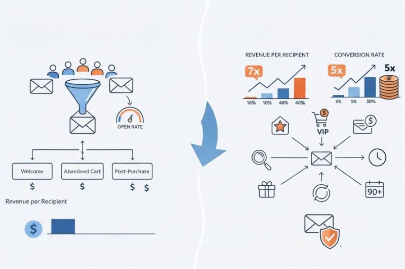
Revenue per recipient by flow type
According to Klaviyo’s data, here’s what average vs top 10% performers usually get in RPR (revenue per recipient):
- All flows: $1.68 average, $16.15 top 10%
- Welcome flow: $2.35 average, $20.92 top 10%
- Abandoned cart flow: $3.07 average, $27.12 top 10%
- Abandoned browsing flow: $0.95 average, $7.05 top 10%
- Post-purchase flow: $0.38 average, $5.27 top 10%
Abandoned cart flows generate the most revenue per recipient because they target high-intent shoppers who were one click away from buying. Welcome flows come in second because new subscribers are the most engaged they’ll ever be.
The difference between average and top performers is staggering: top performers earn 9.6x more per recipient on average. In abandoned cart flows specifically, 8.8x more.
All this comes down to sending the right email to the right person at the right time.
What top performers do differently
Top 10% performers aren’t just lucky.
Klaviyo’s benchmark data shows that top performers get 5x higher order rates and 7x higher revenue per recipient than average users. The difference, as we’ve mentioned, isn’t bigger discounts or flashier creative but better segmentation and precise timing. Below, we’ll explore how exactly these two groups differ.
Segmentation
Average performers send the same abandoned cart email to everyone. Top performers segment by cart value, past purchase behavior, and engagement history. Someone with a $500 cart gets a different message than someone with a $50 cart. VIP customers get early access; first-timers get social proof.
Klaviyo’s peer group data shows that businesses in the 75th percentile for email revenue percentage (36.7%) send to smaller, more targeted segments. They’re picking the right people instead of just blasting their entire list.
Automation
Most brands run three boring flows: welcome, abandoned cart, and post-purchase. Top performers run seven or more, including:
- Browse abandonment (catches people before they add to cart)
- Customer winback (targets people who haven’t purchased in 90+ days)
- Repeat purchase reminders (for consumables and replenishment)
- VIP tiers (reward high-value customers with exclusive access)
The more behavioral triggers you have, the more revenue you capture from moments that would otherwise disappear.
But even the best segmentation and timing won’t save you if your emails land in spam. InboxAlly prevents this by teaching Gmail, Yahoo, and Outlook to trust your sender reputation. Book a free demo and stop losing revenue to the promotions tab.
Tracking marketing metrics
Average performers obsess over open rates. Top performers focus on revenue per recipient and conversion rate since these are the metrics that actually correlate with revenue growth. If your RPR is going up but your open rate is flat, you’re doing it right.
The SMS factor
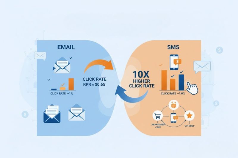
In today’s world of social media and short-form video advertising, SMS doesn’t get enough credit. Yet, very few marketers know that SMS click rates average nearly 10x higher than email and that SMS revenue per recipient often beats email, especially in flows. A brand we analyzed saw SMS generating $1.60 per recipient vs. $0.65 for email. That’s a 2.5x difference.
SMS works because it’s intrusive in a good way. People check texts immediately, while emails can sometimes stay unopened in inboxes for days.
However, there is a catch. SMS lists are smaller, and the cost per message is higher, which means that you can’t blast your entire list daily like you can with email. Use SMS for high-intent moments: abandoned carts, back-in-stock alerts, and VIP-only drops. Save email for everything else.
Industry-specific benchmarks worth knowing
Industry email benchmarks give you a rough sense of where you should land, but try not to obsess over them. Peer group data is more useful because it accounts for business size and model.
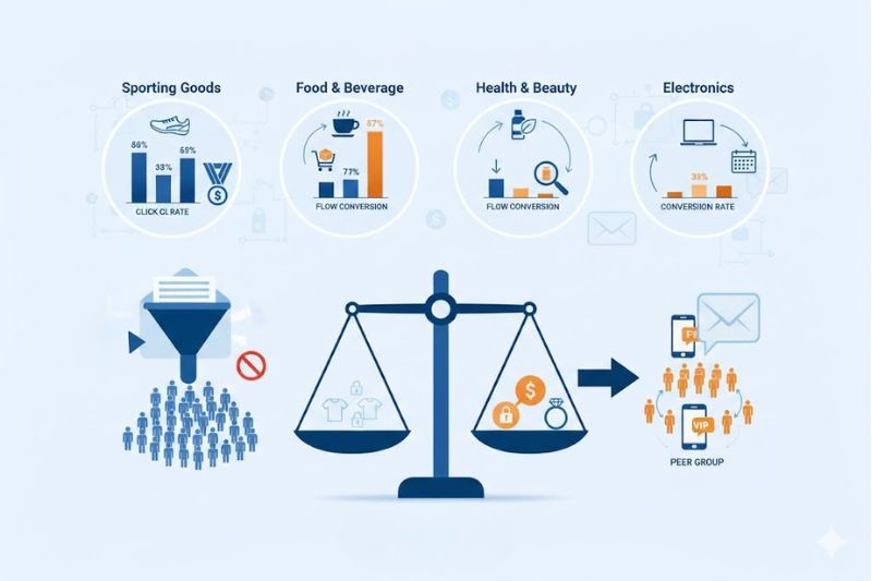
That said, here are the standout patterns by industry:
- Sporting Goods leads in campaign open rates (39.90%) and click rates (1.54%). Sports shoppers tend to be highly engaged and often subscribe through giveaways or loyalty programs.
- Food & Beverage has the highest campaign conversion rate (0.17%) and good flow performance (1.72% conversion). Repeat purchase rates are high since coffee, snacks, and meal kits are consumables and often reordered.
- Health & Beauty lags on campaign click rates (0.91%), likely due to market saturation and hefty discounting. But flow conversion rates are still good (1.39%), which shows that personalized recommendations work better than broadcast promotions.
- Electronics has the lowest campaign conversion rate (0.04%). High price points mean longer consideration cycles. After all, shoppers don’t impulse-buy a $1,200 laptop from a single email.
Use these as reference points. A jewelry brand with a $300 average order value shouldn’t benchmark against a $15 t-shirt brand just because they’re both “ecommerce.” Peer group comparison is what actually matters.
Use benchmarks, don’t worship them
Benchmarks tell you if you’re in the ballpark, but not what’s broken or how to fix it.
But you don’t have to strive for the 75th percentile on every metric. Instead, try to identify your weakest link and improve it. Klaviyo’s benchmark tool shows you exactly where you’re falling short. Start there.
And if you’re already in the top 10%, keep testing and improving. The brands at the 90th percentile aren’t standing still.
But before shooting for the stars, make sure you can get off the ground. Train email providers to trust your domain and skip spam filters with InboxAlly. Book your free demo.