
Google searching “good email open rate” will usually get you a mess of answers: 15%, 25%, 40% “if you’re really good.” None of it addresses what you sell, who you email, or how you got those addresses.
Benchmarks can be useful, but only when you slice them properly by:
- Industry
- Type of email (newsletter vs promo vs onboarding)
- The quality of your list
Otherwise, you’re just comparing your program to a fantasy average that almost nobody is at.
In this article, we’ll walk through realistic ranges by industry and, more importantly, what those numbers say about the efficiency of your email program.
Key takeaways
- Benchmarks only make sense in context: “Good” email marketing performance depends on your industry, audience type, and lifecycle stage, not on one global average from a random report.
- Reputation and engagement decide placement: Inbox providers evaluate spam complaints, engagement, and authentication, so improving list quality and trust is just as important as writing better emails.
The benchmark basics: which email metrics are important in 2025

Most industry leaders still start with the open rate. It’s useful, but way less than it used to be, now that we’re in 2025. Apple’s Mail Privacy Protection (MPP) preloads images and fakes a lot of “opens,” so anything with a big Apple Mail audience will look better on paper than it really is.
That’s why click-through rate (CTR) and click-to-open rate (CTOR) are better indicators of your campaign’s performance. CTR tells you how many people clicked out of everyone who got the email. CTOR shows how many clicked out of those who opened. Together, they tell you if people just glanced or actually read your email.
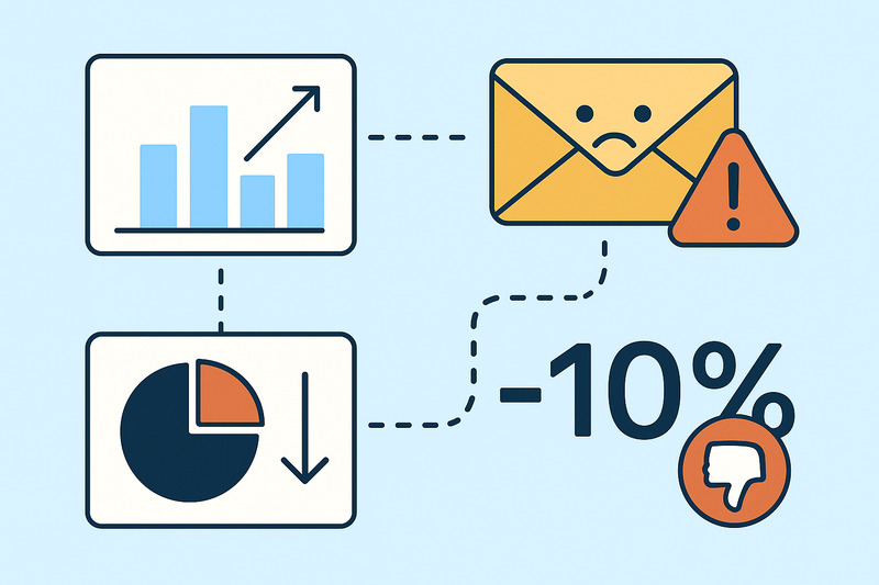
The other two notable email marketing metrics are the average unsubscribe rate and spam complaint rate. Unsubscribes hurt feelings, but complaints hurt deliverability. If you go much above ~0.3% complaints, inbox providers will start treating you like a problem, no matter how attractive your design is.
For some programs, the real north stars are conversion rate and revenue per recipient. If you’re in ecommerce or SaaS, that’s where you see whether the email did its job.
But here’s the most important bit: email deliverability is ingrained into all of this. Poor inbox placement drags every metric down, and high spam complaints or bad engagement drag deliverability down in return. It’s one system that keeps reinforcing itself, for better or worse
Want deliverability on your side? Book a free InboxAlly demo and see how better inbox placement improves every key metric.
Overall email marketing benchmarks across industries
If you mash all the studies together, the “across all industries” picture looks fine but pretty meaningless on its own.
Most recent benchmark reports put the average email open rate somewhere in the high 30s to low 40s once you factor in Apple’s inflated opens. MailerLite’s 2024 email marketing benchmark data, for example, lands around a 42% median open rate with roughly 2% click rate and ~0.08% unsubscribes across all industries. Mailchimp and others show similar click ranges in the 1–3% band.
That’s a nice sanity check: if you’re at 5% opens, 0.1% clicks, and an increase in bounce rate, you know something’s deeply off. But if you’re “a bit below average,” it tells you almost nothing without context.
Cold outreach vs. opt-in newsletters will never share the same baseline. A small, loyal B2B list and a massive ecommerce promo list shouldn’t be judged by the same yardstick either.
So use these global numbers as a rough “are we in the same stadium?” view. The real performance check is how your own opens, clicks, and complaints develop over time, not whether you perfectly match a blended global average.
Industry snapshots: how benchmarks change by vertical
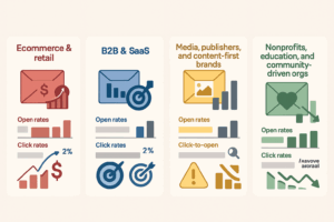
4.1 Ecommerce & retail: lower opens, higher intent
Most benchmarks put Ecommerce open rates in the low 30s and click rates around 1–3% for retail-style email marketing campaigns. On paper, it’s nothing crazy, but when the targeting and timing are right, revenue per recipient can be outstanding. A small bump in CTR can mean a lot of extra carts.
When ecommerce numbers look bad, it’s usually not a “subject line problem.” It’s batch-and-blast behavior: the same promo to everyone, no real segmentation, and years of unengaged email recipients still sitting on the list. That translates into low opens, terrible click-through rates, and rising unsubscribe or spam complaint rates around big sale pushes. If your benchmarks slide the most on days when you “email everyone,” that’s a telling sign.
4.2 B2B & SaaS: smaller lists, sharper engagement
B2B and SaaS lists tend to be smaller but more focused. Recent reports put B2B opens in the mid-20s to low-30s, with CTRs around 2% and higher click-to-open on good campaigns. The game here isn’t blasting the biggest audience; it’s getting the right people to move one step closer to the pipeline.
Red flags are slightly different: high unsubscribes on product updates, webinar invites that nobody clicks, or “customer” emails that look like generic marketing. If your supposed high-intent emails are underperforming your general newsletter, it usually means your messaging is not great, your segmentation is lazy, or your deliverability is weaker than you think.
4.3 Media, publishers, and content-first brands
Publishers and content-driven brands often post some of the best open rates, with many newsletters hovering around the mid-30s or higher when the topic lands. Click-to-open can be good too, but only when the story hook matches what readers want to hear about that week.
Sub-par benchmarks here almost always point to a content-market fit problem. Too many “updates,” poor engagement, generic headlines with the same angle reheated three times. If the open rate is still decent but CTOR drops over time, your audience is basically saying, “I’ll skim the subject line, but I don’t trust you to be worth a click.” At that point, we’re looking at a value issue.
4.4 Nonprofits, education, and community-driven orgs
Nonprofits and community orgs can see some of the highest engagement when the relationship is authentic. Average open rates are around the high-20s to mid-30s, and click rates are often above general commercial industry averages. When the mission resonates, people actually read, share, and act.
The danger comes when that trust gets overused with huge fundraising pushes, back-to-back appeals, or “urgent” campaigns every other week. Benchmarks then show the opposite: send volume goes up, CTR drops, and unsubscribes and spam complaints start to rise. If your busiest months show the worst engagement, you’re most likely burning the audience’s attention, not just “campaigning hard.”
When your numbers are behind the benchmarks
So how should you read these industry trends?
If opens and clicks are both low, that’s rarely “we just need better email subject lines.” It usually means you’re emailing the wrong people, not sending relevant content, or both. Fix the value and targeting before you obsess over wordplay.
If opens are high but clicks are low, you’ve got a different problem. People are curious enough to look, then give up. That can mean clickbait-y subjects, confusing layouts, or offers that don’t live up to the promise. Sometimes it’s also a placement issue: your emails land in Promotions, people skim, then move on.
If unsubscribes and spam complaints are high, that’s your subscriber list yelling back at you. This usually means one of three things:
- People didn’t understand what they signed up for
- The content doesn’t match their expectations
- The sending frequency jumped without warning.
Complaints, especially, are a deliverability landmine, and if you ignore them, inbox providers will handle you for you.
If your email benchmarks look fine overall but drop hard at one provider (for example, Gmail is way worse than Outlook or Yahoo), you’ve crossed from “content issue” into deliverability and sender reputation territory. Same email, different treatment is exactly how inbox providers tell you there’s a trust problem under the hood.
Use benchmarks this way: “If my numbers look like X, the story underneath is probably Y.” That’s where decisions get easier.
How to use benchmarks without driving yourself nuts

Benchmarks are not there to tell you if you’re “good” or “bad,” but where to look next.
First mindset shift: treat benchmarks as ranges, not magic targets. “Ecommerce CTR often lands around 1–3%” is a range. If you’re at 0.4%, that could be a problem. If you’re at 1.6%, it might be fine (or not) depending on who you email and what you sell.
Second: always compare like with like. Benchmarks only make sense when you stack them against:
- Industry (B2B SaaS vs fashion retail is not a fair comparison)
- Lifecycle stage (welcome, promo, re-engagement, product update)
- Audience type (customers vs leads vs pure newsletter subscribers)
A 60% open rate on a tiny, high-intent onboarding flow is not the same as 60% on a giant promo list. You know that, but benchmarks will happily blur it.
Third: watch trends, not single spikes. Month-over-month and quarter-over-quarter are where the truth surfaces. One bad campaign could be due to timing, a dull subject, or inbox providers being in a bad mood. Three months of decline, however, may be due to your email marketing strategy or deliverability.
So instead of “Our CTR is 0.8%, we suck,” try better questions:
- “Is this low for our industry and list type, or is it actually normal?”
- “Does this look like a dynamic content issue, or more like a reputation/inbox placement issue?”
That’s how experienced marketers use benchmarks: as a guideline for decisions, not as a scorecard for self-blame.
Where InboxAlly fits when benchmarks point to deliverability trouble

There’s a point where you’ve tweaked subject lines, cleaned segments, improved offers… and your numbers are still way below industry benchmarks. That’s usually the moment the problem moves from “content” to deliverability.
If inbox providers don’t trust you, your best marketing emails never get a fair chance. But that’s something you can solve with InboxAlly.
InboxAlly works at the inbox level. Its seed accounts behave like real subscribers: they open emails, scroll, click, reply, pull messages out of spam, and mark them as important. Those actions are the exact engagement signals Gmail, Yahoo, Outlook, and other mailbox providers already watch to decide who belongs in the inbox.
Over time, that steady stream of positive signals helps repair a weak domain or IP reputation and supports better inbox placement. Then your real audience finally starts seeing your emails again, and your own engagement metrics can catch up to where your content and strategy already are.
If you’re ready to lift those numbers and set a new bar in your industry, book a free demo with InboxAlly and see what happens when deliverability finally starts working the way you want it to.
Benchmarks are an average; don’t settle for “average”
Benchmarks are there to tell you if you’re in the right ballpark and nothing more. They don’t know your brand, your offer, or the weird little quirks of your target audience. You do.
If your numbers are far below industry ranges, take it as a sign: clean the list, improve the value, check your deliverability, and sender reputation. Don’t indulge in self-blame. Good luck!