
Most of us scroll through dozens of emails every day, and the ones that grab our attention aren’t walls of text. They’re the emails with sharp visuals, clean layouts, and graphics that make us want to click. Email graphics aren’t just decoration; they’re engagement tools that guide the eye, reinforce your message, and make your content scannable in seconds.
But here’s the thing: even the most beautifully designed email graphic won’t matter if your emails don’t reach the inbox in the first place. Graphics that load slowly, throw off your text-to-image ratio, or aren’t optimized for mobile can hurt your sender reputation and push your emails straight into spam folders. In fact, poor engagement metrics from badly designed emails can signal to ISPs that your content isn’t valued, which directly impacts inbox placement.
In this guide, we’ll walk through real-world email graphic examples from brands that are doing it right with visuals that drive engagement while keeping deliverability in mind.
Key Elements of High-Performing Email Graphics
Before we get into specific examples of email marketing, let’s cover the foundational elements that make email graphics effective.
Clear Visual Hierarchy
Visual hierarchy guides your reader’s eye from the most important element to the next. A well-structured email graphic uses size, color, contrast, and placement to create a natural flow. When you design email templates with a clear hierarchy, readers can scan your email in seconds and understand exactly what you’re offering. This clarity directly supports engagement, which in turn supports your sender reputation.
Fast-Loading, Optimized Graphics
Slow-loading emails frustrate readers and hurt engagement metrics. Keep your total email size under 1MB, with individual images ideally under 500KB. Use JPEGs for photos, PNGs for logos and graphics with transparency, and save GIFs for intentional animation. The faster your email graphic loads, the more likely recipients are to engage with your content.
Balanced Text-to-Image Ratio
Spam filters don’t like image-heavy emails because they can’t read images to determine if your content is legitimate. Keep your email under 40% images and over 60% text. This balance helps your emails pass through filters while still delivering a visually engaging experience. Too many graphics for email without enough text content is a red flag that can land your campaign in spam folders.
Dealing with delivery problems? InboxAlly can help keep your beautifully designed emails out of spam and in front of your audience.
Mobile-Friendly Graphic Scaling
More than 65% of emails are opened on mobile devices, so your graphics need to scale perfectly on smaller screens. Use responsive email design frameworks that adjust email image size automatically, and test your email templates across multiple devices. When designing email layouts, always consider the mobile experience first.
Accessible and Readable Design
Always include alt text for every image so readers using screen readers or those with images disabled can still understand your content. Use high contrast between text and background colors, and make sure your fonts are large enough to read comfortably. When images don’t load (which happens often), your alt text ensures your message still gets through.
Engagement-Focused Graphic Placement
Place your most compelling visual near the top to grab attention immediately, position graphics around your CTAs to draw the eye toward action, and use visuals to break up longer sections of text. When graphics support engagement, they indirectly support your sender reputation by boosting the metrics ISPs care about. If engagement starts dropping, even beautiful graphics won’t save your campaign from the spam folder.
Best Email Graphic Examples in 2026
Now that you understand the key elements of effective email graphics, let’s explore real marketing email examples from brands using visuals to guide attention, drive engagement, and support consistent email performance.
Promotional Email Graphics Built for Clicks
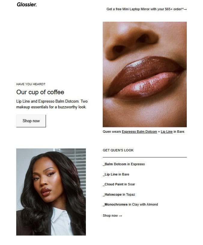
(Source: Milled.com)
Target audience: Beauty enthusiasts and Glossier community members who are already engaged with the brand and responsive to product promotions.
Why we love it: Glossier’s promotional emails are minimalist perfection. Soft, dreamy product photography paired with plenty of breathing room makes each item feel premium and desirable. The brand uses limited text with clear, action-oriented CTAs that don’t compete with the visuals. What makes this work from a deliverability standpoint is the balanced approach: enough high-quality imagery to showcase products, enough text to keep spam filters happy. This balanced approach is exactly what you need to avoid landing in spam.
Best for: Product promotions, seasonal launches, new arrival announcements, and any campaign where you need to drive immediate action while maintaining brand sophistication.
Product-Centered Email Graphics
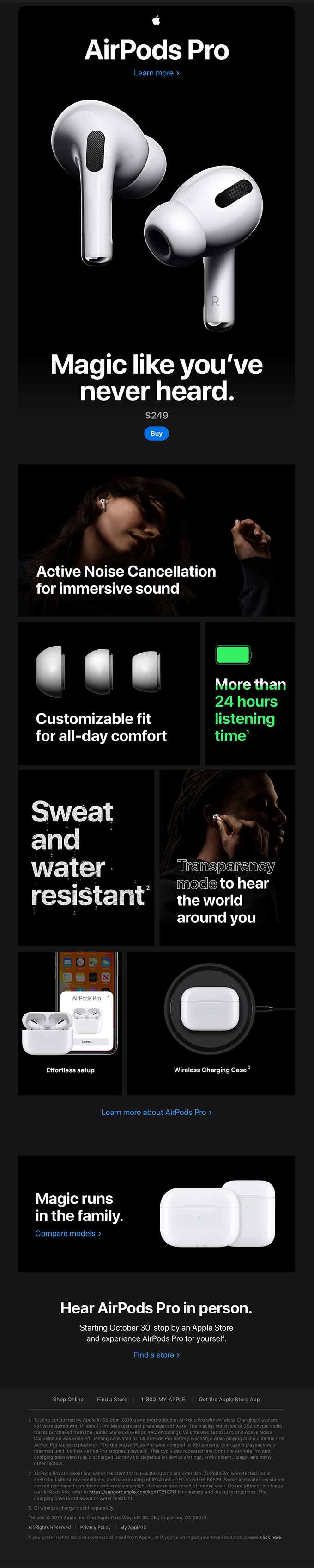
(Source: Reallygoodemails.com)
Target audience: Tech-savvy consumers and existing Apple ecosystem users who appreciate premium design and seamless product integration.
Why we love it: Apple’s product launch email is a masterclass in minimalism. The high-quality product photography sits against generous white space, letting the AirPods Pro shine without distraction. Multiple strategic CTAs guide readers toward learning more or purchasing. The text-to-image ratio is perfect with enough visuals to showcase the product’s beauty and enough text to avoid spam filters.
Best for: Product launches, feature announcements, premium product showcases, and campaigns where the product itself is the hero of the story.
Illustrated Email Graphics for Brand Personality
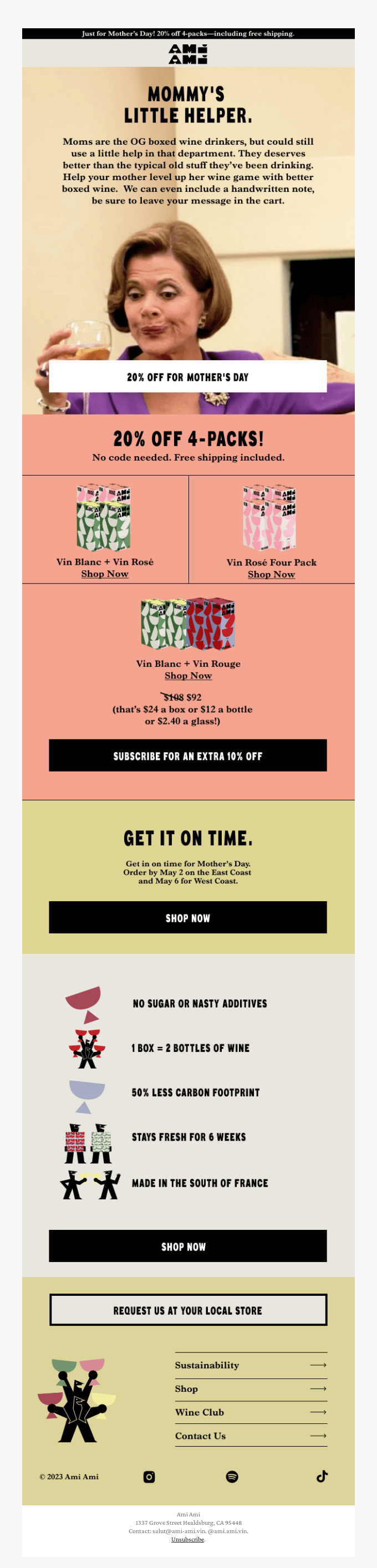
(Source: Reallygoodemails.com)
Target audience: Millennials and Gen Z wine enthusiasts looking for brands that break away from traditional, stuffy wine marketing.
Why we love it: Ami Ami’s newsletter explodes with personality through colorful graphics and 90s cultural references that make the brand instantly recognizable. The illustrated graphics create a genre-defying identity that stands out from legacy wine brands while maintaining readability. The visuals are vibrant without being overwhelming, and the email designs keep engagement high without sacrificing deliverability.
Best for: Emerging brands, lifestyle products, subscription services, and any business trying to differentiate itself with bold personality and creative visuals.
Minimalist Email Graphics That Let Text Lead
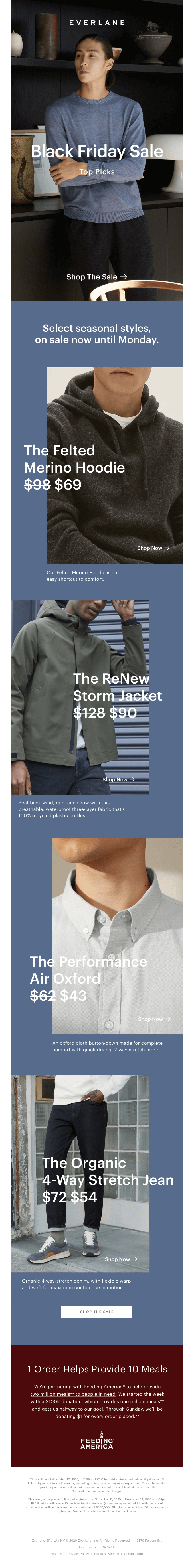
(Source: Reallygoodemails.com)
Target audience: Conscious consumers seeking sustainable fashion who value transparency and simplicity over aggressive sales tactics.
Why we love it: Everlane’s Black Friday email takes the “less is more” approach seriously. Neutral colors, simple layouts, and a monochromatic email design create a personalized note feel that stands out in cluttered inboxes. From a deliverability standpoint, this email is gold with a high text-to-image ratio, fast loading times, and clean code that ISPs love.
Best for: Seasonal promotions, brand storytelling, sustainable or ethical brands, and campaigns where you want to cut through the noise with simplicity.
Animated or GIF Email Graphics (Used Carefully)
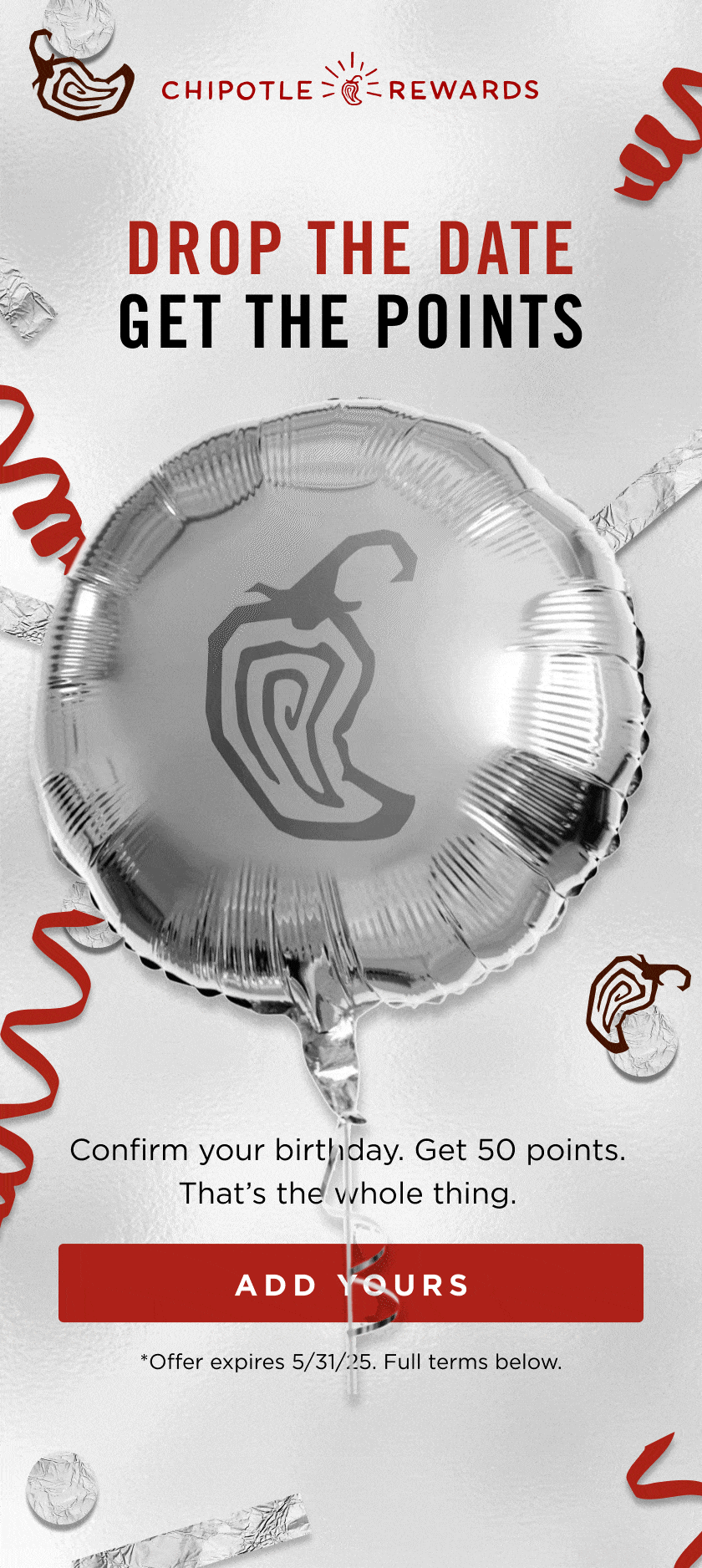
(Source: Milled.com)
Target audience: Loyalty program members and food enthusiasts who respond well to playful, engaging content.
Why we love it: Chipotle knows how to use animation without going overboard. Their promotional emails often feature a single animated GIF showcasing fresh ingredients or a finished bowl being assembled, creating appetite appeal while keeping file sizes manageable. The animation is purposeful rather than distracting, and the email includes plenty of static text to ensure the message comes through even if the GIF doesn’t load. When you use animation this strategically with proper alt text, you get engagement without putting deliverability at risk.
Best for: Food and beverage promotions, limited-time offers, loyalty rewards, and any campaign where movement can showcase your product or create excitement without overwhelming the inbox.
The best designs mean nothing if your emails don’t reach inboxes. With InboxAlly, you can strengthen your sender reputation and keep your campaigns performing consistently.
Event or Announcement Email Graphics
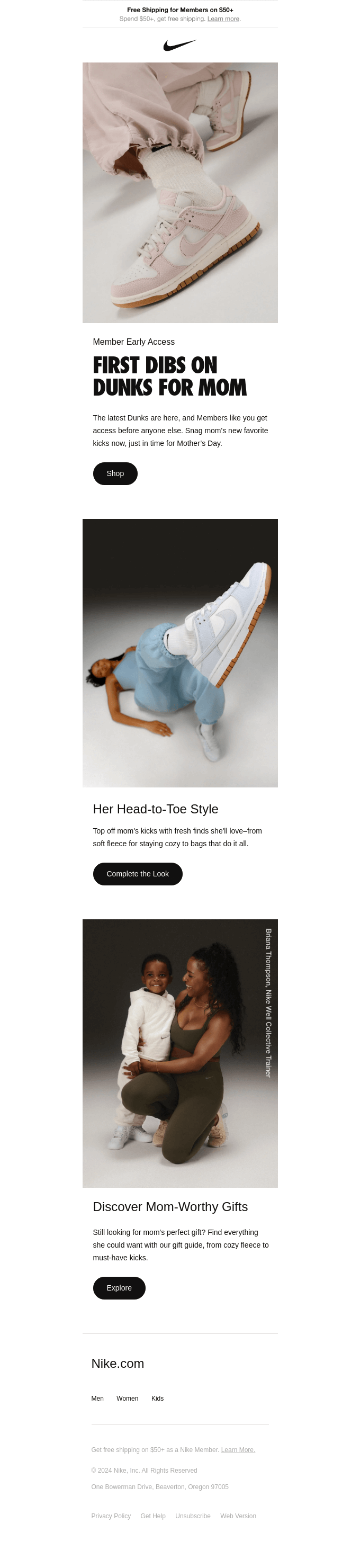
(Source: Reallygoodemails.com)
Target audience: Nike members and sneaker enthusiasts who value early access and limited releases.
Why we love it: Nike’s launch email hits you with emotional imagery first (a mother and son moment) before diving into bold product visuals. The “First Dibs on Dunks for Mom” headline triggers emotion and exclusivity at once. Clear CTAs like “Shop,” “Complete the Look,” and “Explore” guide action without overwhelming. The graphics are balanced perfectly with text, and product images load fast across devices.
Best for: Limited releases, member exclusives, holiday campaigns, launch events, and any announcement where timing and emotional connection matter.
Newsletter Email Graphics That Guide the Eye
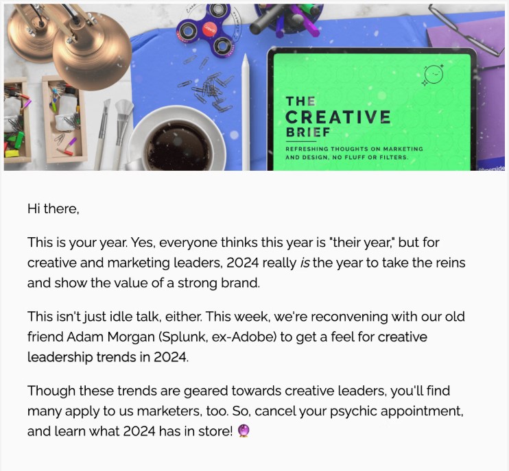
(Source: Superside.com)
Target audience: Email marketers, designers, and creative professionals looking for inspiration and industry best practices.
Why we love it: Really Good Emails’ newsletter perfectly practices what it preaches. Clean typography, strategic use of white space, and carefully curated email examples create a scannable layout that respects your time. The visual hierarchy guides you effortlessly from featured emails to quick tips, with graphics that complement rather than overwhelm the content. The text-to-image balance is spot-on, which means spam filters won’t flag it as image-heavy.
Best for: Weekly newsletters, content marketing campaigns, educational content, and any brand that wants to establish thought leadership while maintaining professional deliverability standards.
Transactional Email Graphics That Add Clarity
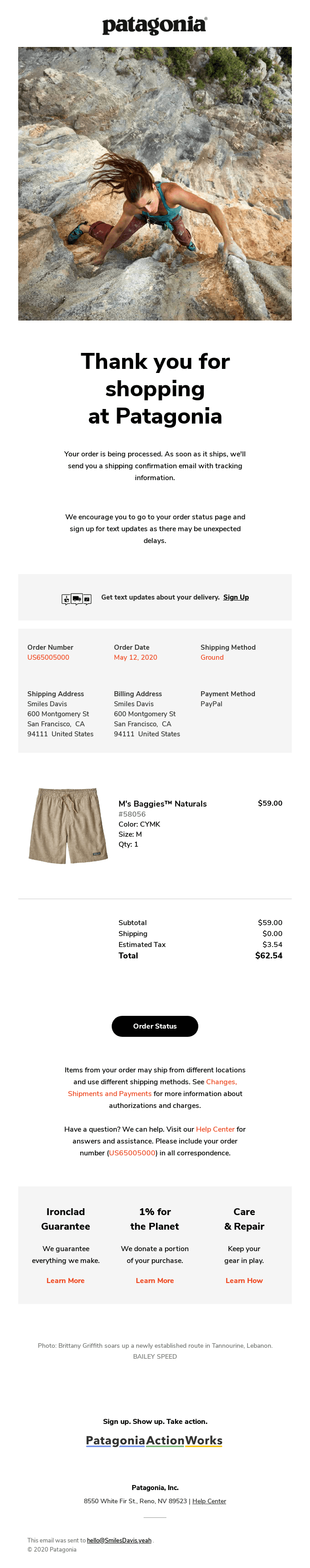
(Source: Reallygoodemails.com)
Target audience: Outdoor enthusiasts and eco-conscious shoppers who’ve just made a purchase and want reassurance their order is being handled.
Why we love it: Patagonia’s order confirmation is clean, functional, and subtly inspiring. The email template layout uses white space effectively, with bold fonts highlighting key details like order number and delivery date. Transactional emails like this receive up to 70% open rates (the highest of any email type), so keeping graphics minimal ensures deliverability stays strong while still providing a premium experience.
Best for: Order confirmations, shipping notifications, account updates, password resets, and any transactional moment where clarity and trust are paramount.
Email Graphic Size and Layout Best Practices
Getting your email graphic dimensions right isn’t just about aesthetics; it’s about ensuring your emails load quickly, display correctly across devices, and maintain strong deliverability. The standard email width is 600 pixels, which works safely across most email clients and devices. You can stretch to 640 to 900 pixels for more modern email template layouts, but test thoroughly before committing.
For banner images, aim for 600 to 900 pixels wide by 200 to 300 pixels high. Your total email height should typically fall between 1500 and 2000 pixels. Header images work best at 600×150 to 600×200 pixels. Keep your total email under 1MB (ideally closer to 500KB) to ensure fast loading times, and individual images should stay under 500KB when possible.
Many email clients block images by default, which means your carefully designed graphics might not appear until the recipient clicks to display them. This is why maintaining a solid text-to-image ratio is essential; your email needs to make sense and drive action even when images don’t load. Include alt text for every image, and structure your content so the message comes through clearly regardless of image display. For more technical guidance, check out email image optimization best practices.
Use high contrast between text and backgrounds, keep fonts large enough to read on small screens, and ensure your color choices work for readers with color vision deficiencies. These practices improve overall engagement, which directly impacts your sender reputation and deliverability over time.
Noticing drops in performance? Time to revisit your email marketing strategy and get your campaigns back on track.
Begin Your Email Graphic Strategy With InboxAlly
Strong email graphics only perform if your emails reach inboxes in the first place. You can design the most stunning visuals and optimize every element for engagement, but if your emails land in spam folders or get throttled by ISPs, none of it matters. Engagement supports sender reputation, and sender reputation determines inbox placement.
Looking to improve your inbox placement? Try InboxAlly and watch your email performance improve as your messages consistently land where they belong.